Visualization
Plotly with Python in production: strengths and limits (Pokémon Dashboard case)
Introduction
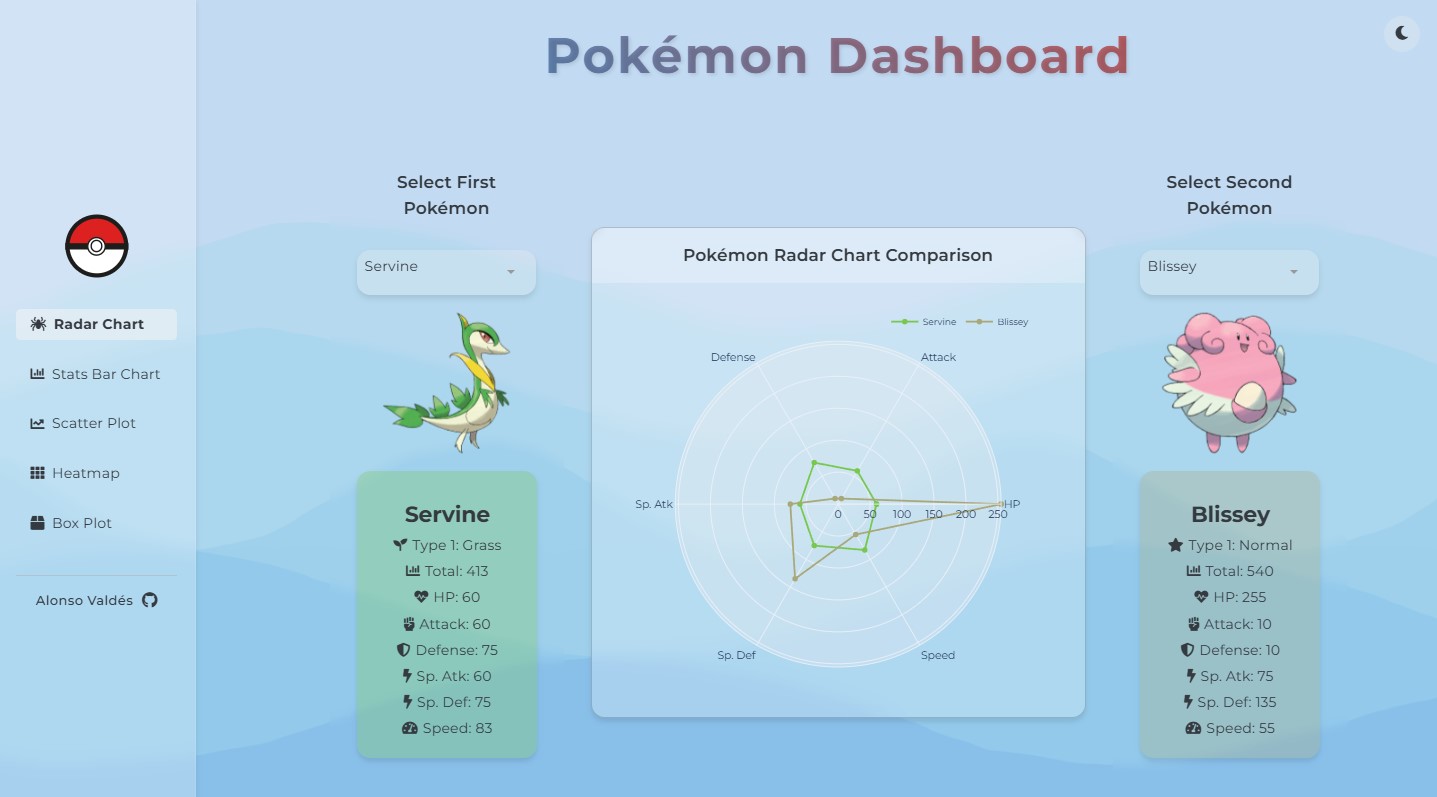
Plotly with Python has become a de‑facto standard to build interactive visualizations without writing JavaScript. It is flexible, productive and powerful enough for a large share of real‑world cases. This post synthesizes benefits, limitations and design patterns that work in production, using my Pokémon Dashboard app as example.
Why Plotly (with Python)
- Short learning curve: if you already use pandas or polars, Plotly Express feels natural.
- Instant interactivity: zoom, pan, hover, selection and interactive legends without coding events.
- Scientific ecosystem: plays well with NumPy, SciPy, scikit‑learn and Jupyter; exports to static HTML.
- Path to app: with Dash or Streamlit, a figure becomes an app (callbacks / state / auth).
- Portability: a single HTML can travel via email, GitHub Pages or any CMS without a backend.
Key advantages
- Productivity. Prototype in minutes with
plotly.expressand refine withgraph_objects. - Visual consistency. Coherent palettes, axes and typography without wrestling with CSS/DOM.
- Chart type coverage. Timeseries, faceting, maps, 3D, ternary plots, densities, sunbursts, treemaps.
- Data integration. Accepts a
DataFramedirectly; column→encoding mapping is explicit and readable. - Export. PNG/SVG download from the UI; export to standalone HTML for sharing without servers.
Limitations and trade‑offs
- Performance with very large data. Above ~200–500k points in browser, interactivity suffers. Use aggregation, sampling and WebGL where applicable.
- Fine‑grained styling. Less granular than pure D3/Canvas; deep customization takes time.
- Bundle size. Pages with many figures weigh more. Mitigate by consolidating traces and reusing layouts.
- Advanced animation. Complex storytelling often works better with native web libraries.
- SEO and SSR. Executable HTML is practical, but semantically limited for indexing.
Patterns that scale
- Data layer: pure
load_*functions with validated schema and caching. - Logic layer:
compute_*for aggregations and rankings; no traces here. - Figure layer:
make_*returnsgo.Figureorpx.*with unified theme and template. - Typed parameters: bundle filters into a typed object; pass it to
compute_*andmake_*. - Testing: visual regression tests and figure.to_dict() snapshots for stability.
# Minimal example (Pokémon)
import pandas as pd
import plotly.express as px

def load_pokemon(path: str) -> pd.DataFrame:
    df = pd.read_csv(path)
    cols = {c: c.strip().lower().replace(' ', '_') for c in df.columns}
    df = df.rename(columns=cols)
    return df

def make_scatter(df: pd.DataFrame, x='attack', y='speed', color='type_1'):
    fig = px.scatter(df, x=x, y=y, color=color, hover_name='name', trendline='ols', opacity=0.8, height=480)
    fig.update_layout(margin=dict(l=16, r=16, t=32, b=16))
    return fig
Applied to the Pokémon Dashboard
- Comparative exploration: scatter of
attackvsspeedcolored by type; rich hover. - Distributions: histograms with
facet_coland adaptivenbins. - Ranking: bars ordered by metric; dynamic axis limits.
- Responsive: coherent heights and compact margins; single global palette.
- Export: download to PNG/SVG to share findings.
Performance checklist
- Reduce columns before passing the
DataFrameto the figure; avoid hot joins. - Use aggregations for global views; offer drill‑down only on demand.
- Reuse
layoutand themes; avoid recomputing scales when only filters change. - Enable WebGL on dense point clouds.
- Memoize intermediate results and limit JSON size in apps.
Accessibility and UX
- Sufficient contrast and legible typography.
- Hover templates with units; concise titles and business‑friendly axis labels.
- Clear empty states.
When to prefer another tool
- D3/Canvas: bespoke storytelling, complex animation, pixel‑perfect visuals.
- Matplotlib/Seaborn: static reports, academic papers, strict typographic control.
- Altair/Vega‑Lite: declarative grammar and reproducible specs.
Conclusion
Plotly with Python shines when you need speed for exploration, frictionless interactivity and a direct path to production with Dash/Streamlit. Its limits appear with massive data in browser or extreme customization. With a simple layered architecture and a performance checklist, it’s a solid base for modern analytics products like the Pokémon Dashboard.
Example repository: github.com/Alonsomar/pokemon_dashboard.