Data Visualization
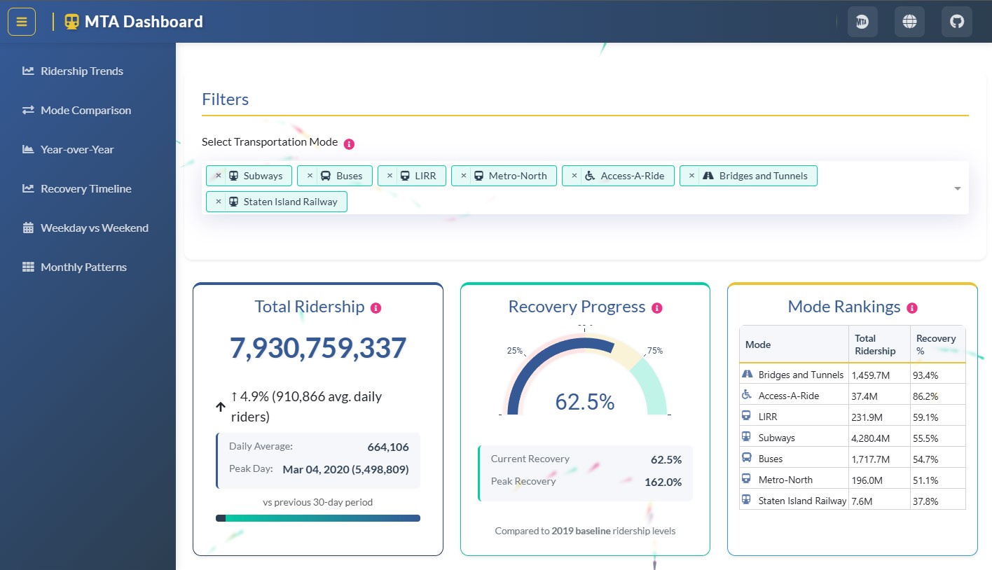
MTA Ridership: a recovery narrative that won first place
The guiding question
How did MTA demand evolve after recent shocks, and what spatial and temporal patterns emerged? The app focuses on answering that question with the minimum necessary complexity.
Design for the story
- Prioritized metrics and normalization for clean comparisons.
- Micro copy and annotations to contextualize milestones (closures, reopenings, events).
- Targeted interaction: essential filters and anchor-based navigation.
Architecture
Built with Dash and Plotly, with light p5.js touches for backgrounds and animation, plus custom CSS. The data pipeline is simple and reusable.
Key views
- Calendar heatmap by line or station.
- Series with a pre-shock baseline and recovery bands.
- Ranked view with drill-down by district or station.
Recognition
First place in the Holiday Season App Challenge - NYC MTA (Plotly Community, Dec 24, 2024).