Public
MTA Ridership
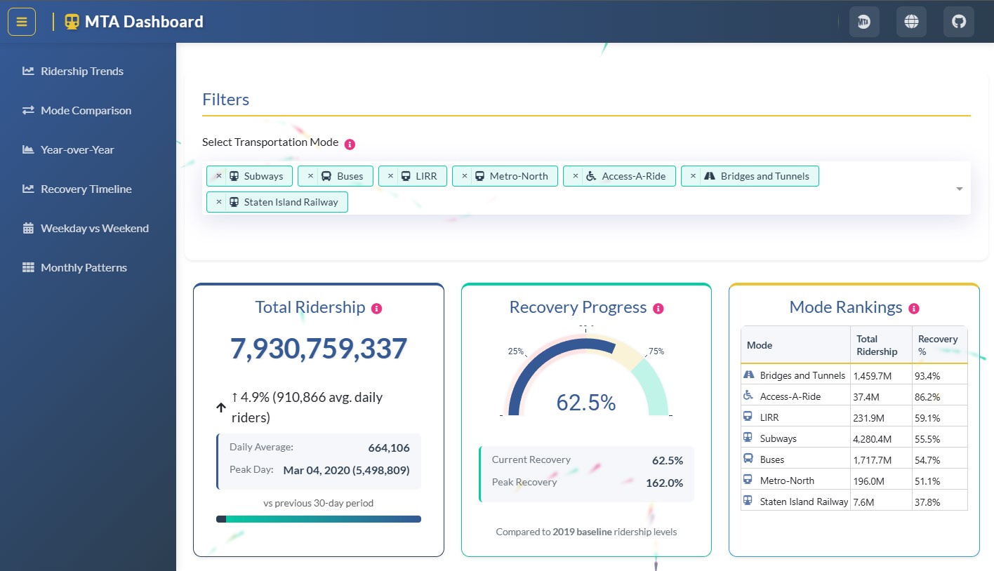
A focused app that explains NYC transit recovery with three key views, sober UX, and a clear narrative. First place in the Plotly Holiday Season App Challenge.
TL;DR
- Narrative Dash app explaining NYC transit recovery with 3 key views.
- Designed for clarity: minimal controls, strong baselines/normalization.
- Shipped publicly with a reproducible repo; won a Plotly community challenge.
Reusable patterns
- Narrative-first dashboard structure: anchors, annotations, and microcopy over “more filters”.
- Baselines + normalization for fair comparisons across time and segments.
- Pre-computed aggregates + simple data model to keep interactions responsive.
- Clear view hierarchy: a few key charts that answer the main question fast.
Context
After recent shocks, MTA ridership shifted abruptly and patterns vary heavily by line, station, and time period.
The goal was to answer a guiding question with minimal complexity: how does demand recover, and where are the clearest signals?
Decisions
- Story-first: fewer controls, more narrative (anchors, microcopy, and annotations).
- Normalization and baselines for clean comparisons over time.
- Pre-computed aggregates and a simple data structure to keep the app responsive.
Architecture
- Dash for UI and callbacks; Plotly gives interactivity by default (hover/zoom/selection).
- Light p5.js + CSS touches to add identity without bloating complexity.
Outcome
- First place in the Plotly Community Holiday Season App Challenge (2024).
- Public demo + reproducible repo (code + assets) to show the “how”, not just screenshots.
- Reusable patterns for other apps: narrative hierarchy and essential filters.